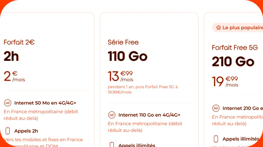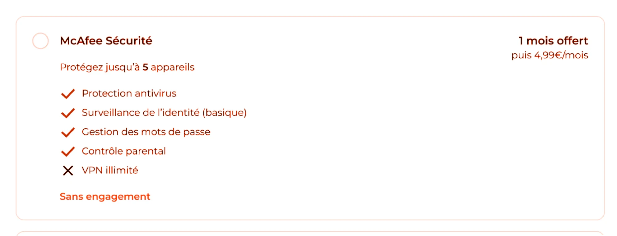
McAfee was sold in our Freebox flows but absent from mobile kiosk journeys, and the best placement was an open question.
Context
McAfee was offered in our Freebox subscription flows but not yet in mobile journeys on kiosks. The targeted KPIs were cross-sell, commercial rebound, and customer satisfaction. The scope covered single-plan journeys for prospects only.
The goal: optimize McAfee adoption among prospects while keeping the sales experience comfortable for advisors.
The challenge: Deliver a first version, designed to evolve, that balances business needs with the in-store experience of both customers and advisors.
My approach
Beyond conversion, I wanted to understand how the option was perceived by customers and advisors, and later assess its impact on churn.
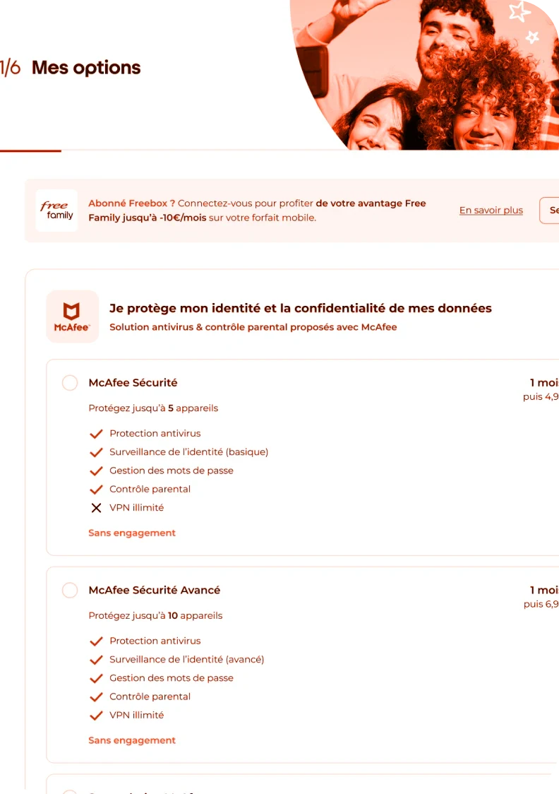
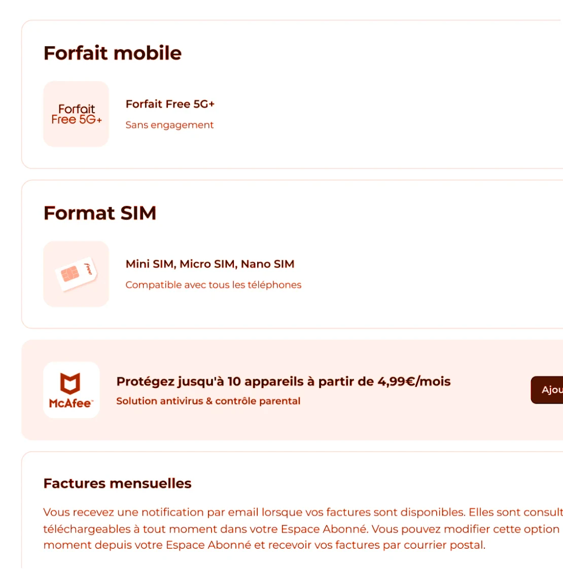
Testing design & hypothesis: A one-month A/B test on kiosks across France with equivalent daily visits. Version A used a dedicated step, version B an add-on at the end of the journey. I expected A to convert better, but B to bring more qualified customers in the long run.
Results: We crossed quantitative with qualitative research to have a realistic overview.
→ Quantitative: As expected, the Version A performed better, it generated 2.11x more sales than B, and 2.25x more sales per kiosk.
→ Qualitative: In version A, the option was perceived as it’s mandatory or even part of the plan, which it is not. Reading time was long, and advisors often had to step in to explain what the option implies. In version B, advisors weren’t comfortable selling the option just before the payment stage, which is a much less natural moment for them to deliver their pitch.
The decision: The version A provided a better starting point for iteration, especially since we had another very similar topic that was going to be added just after that, so we moved forward with this version. We revisited it with mobile insurance added as a second option. The next steps are to check whether McAfee is better understood in this updated step, then, according to our learnings, test displaying options earlier with an “offer configuration” dedicated upstream of the subscription and check churn metrics.
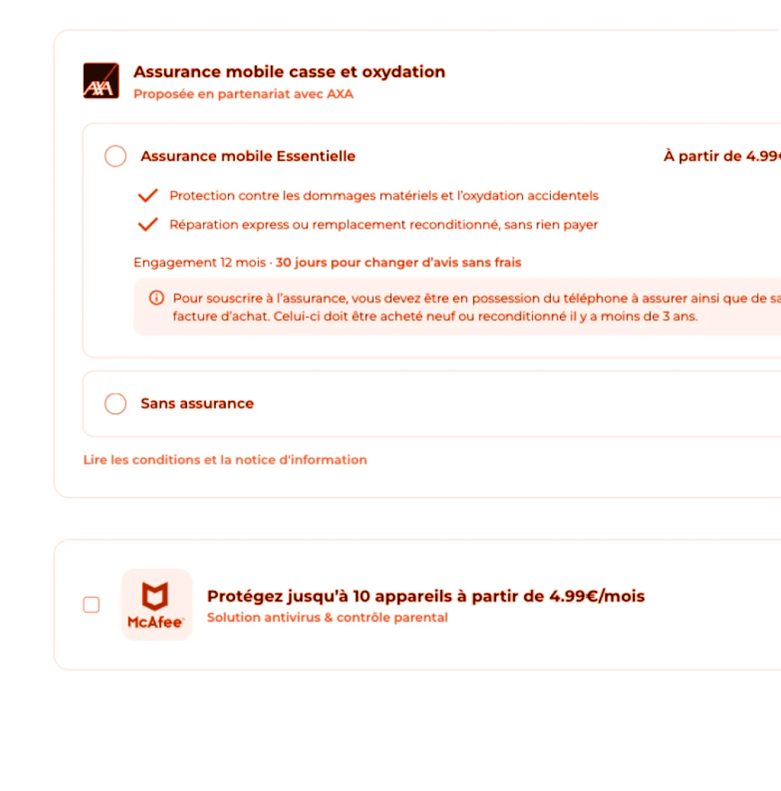
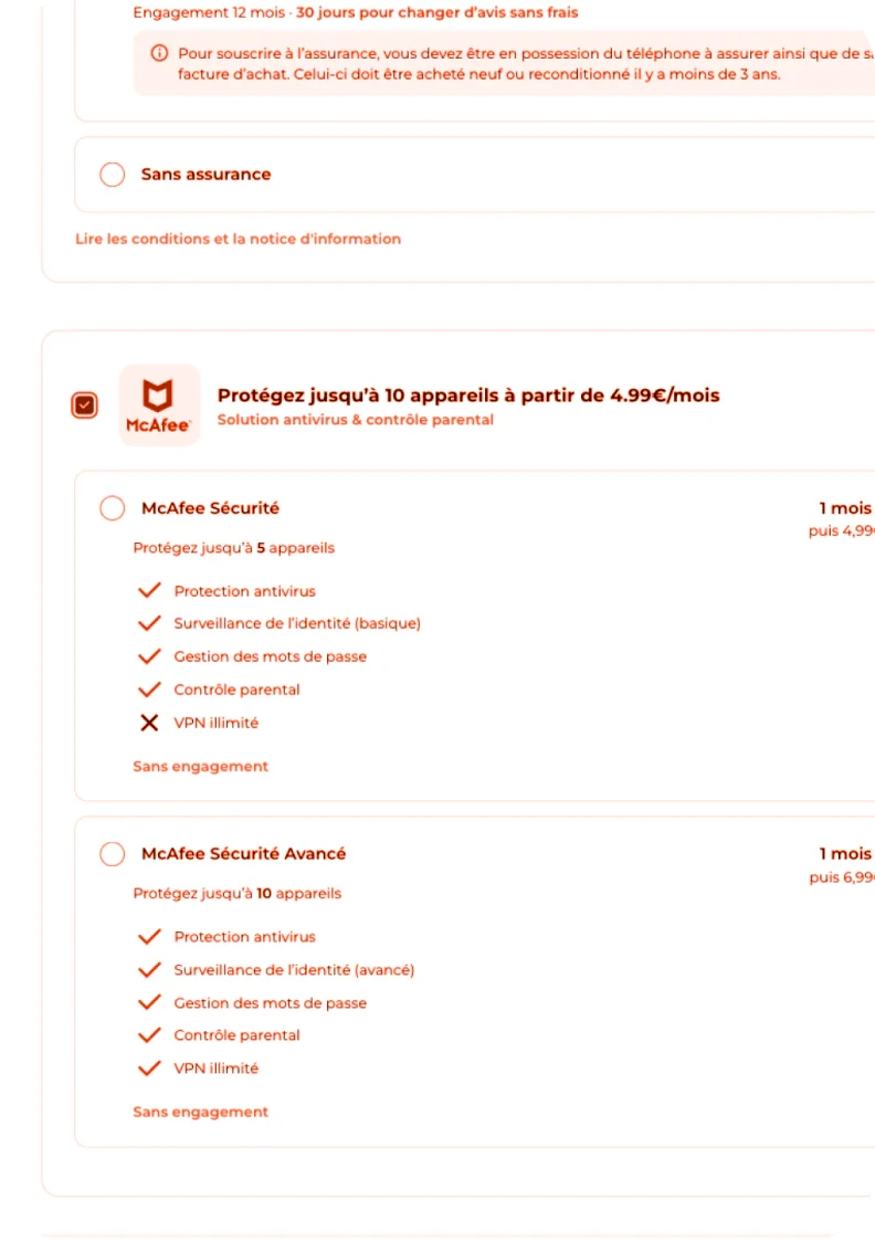
Outcomes
User-driven decision: Thanks to quantitative and qualitative research, we were able to settle on a version that allowed us to iterate and identify opportunities we didn’t expect
Focused on kiosk experience: Raise awareness about the unique in-store kiosk experience, which may differ from what is more commonly found online.
Bonus
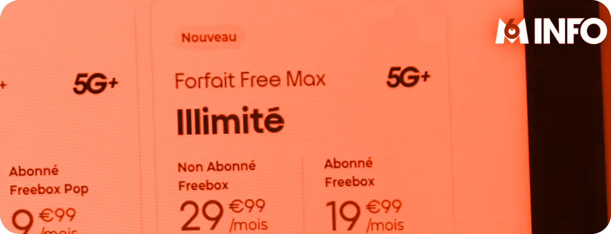
Our kiosks were on TV ➡️ take a look here ⬅️
How I work for kiosk screens 🕹️
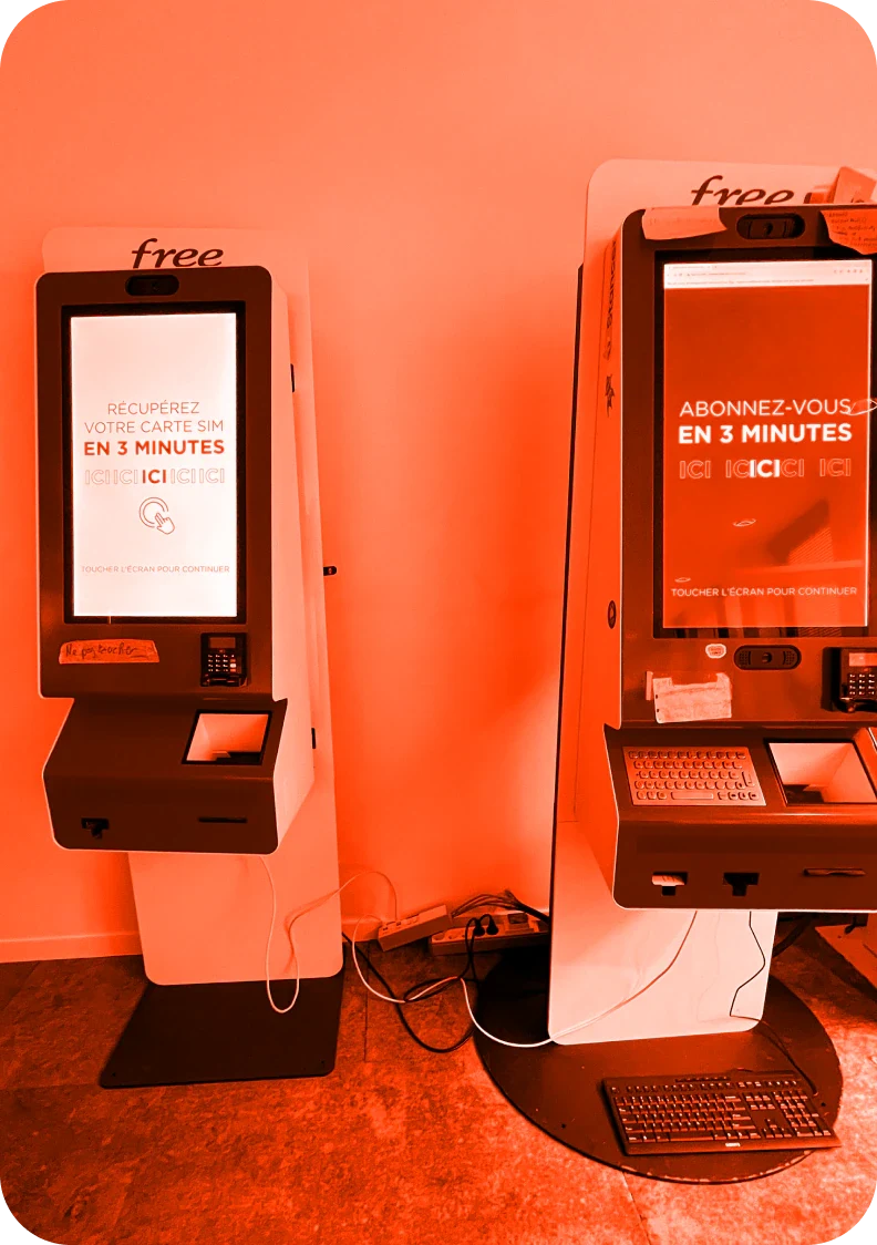
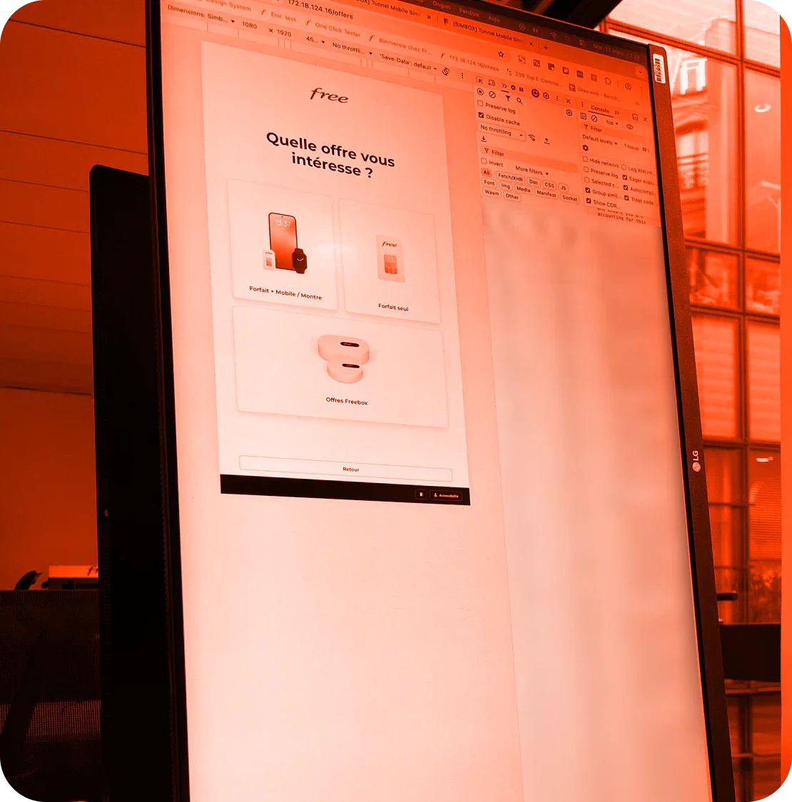
The kiosk on the left is the replica of our live production and the one on the right is our test environment.
I can also access the pre-prod with a localhost link on the web. On top of that, I turn around my PC so it has the same orientation of the self-service kiosk, really helpful when designing on Figma and check the look and feel.