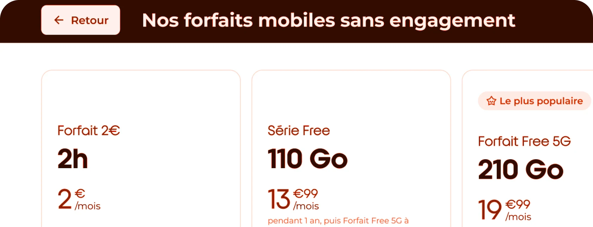
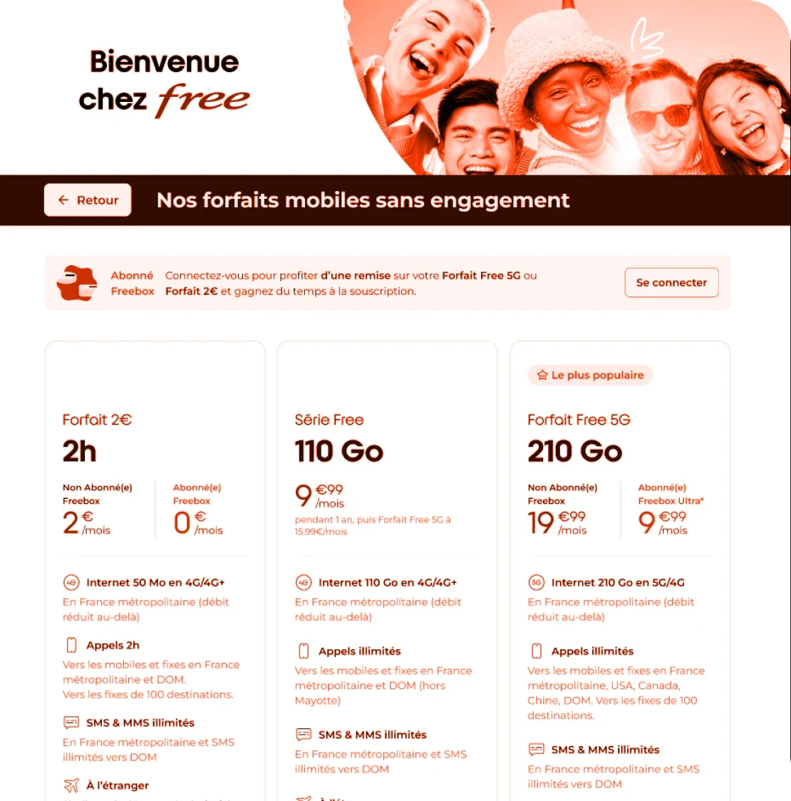
The kiosks don’t display the subscriber price, which is a drawback for conversion and retention, especially since kiosks account for most sales.
Context
Free operates over 250+ retail shops across France. While our web platform allowed users to toggle between standard and discounted "Freebox subscriber" prices, our physical kiosks only displayed standard rates.
The goal: Adapt the pricing display in stores for large-scale self-service kiosk to boost conversion and drive loyalty.
The challenge: Within a week, validate a solution tailored to self-service kiosks and get marketing’s buy-in on not just porting the existing web flow.
My approach
I decided to lead a quick context-driven research phase to validate the best UX for a high-traffic retail setting.
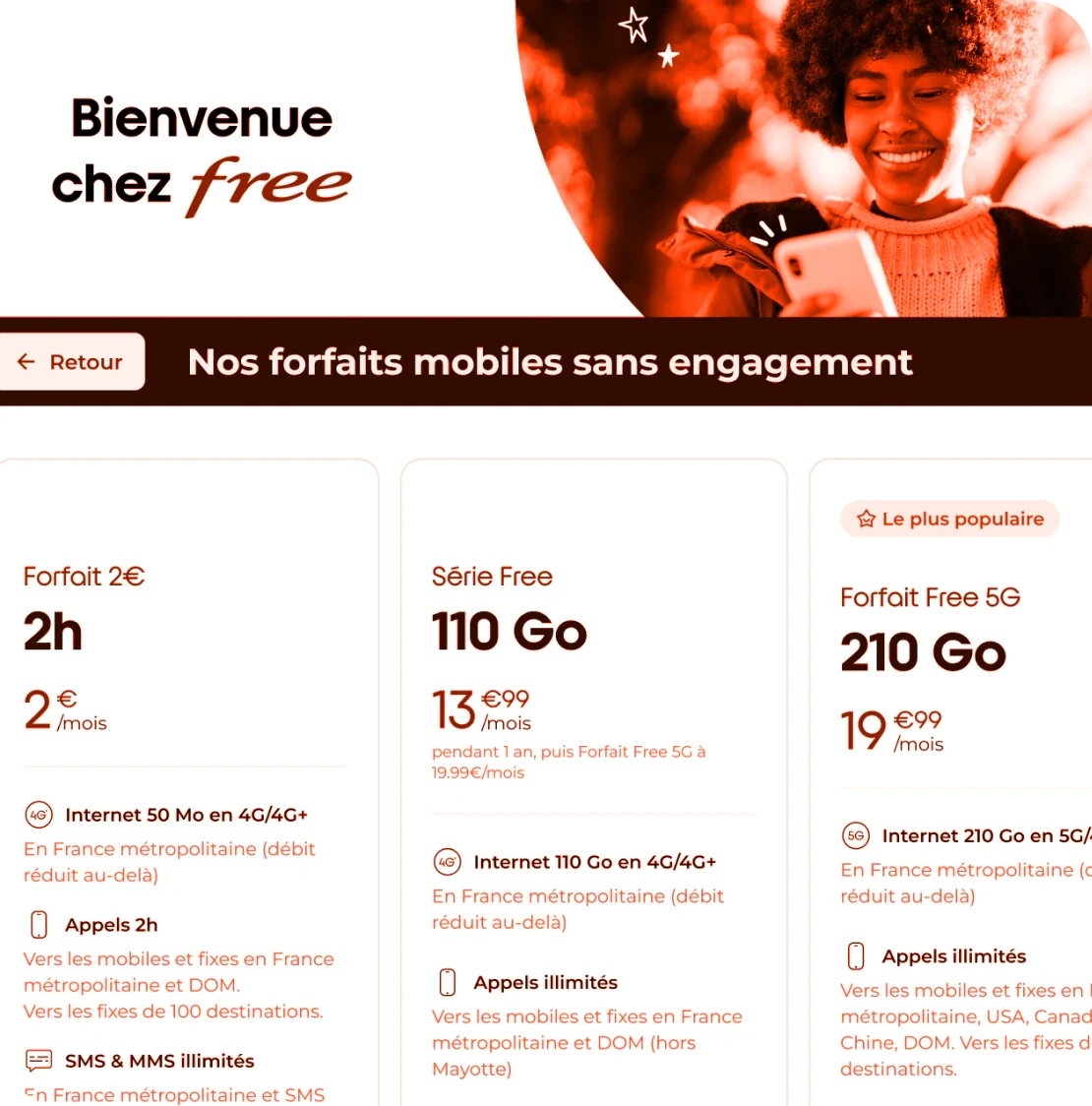
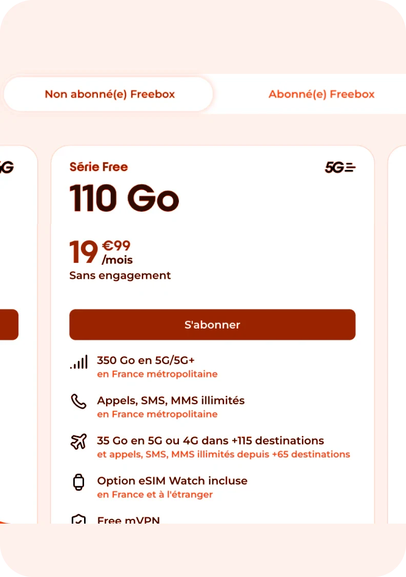
Preparing the research: Before going anywhere, I looked to web and self-service kiosk inspiration. How do they display their prices/offers? Are there multiple prices available? How is the UI used to differentiate them? Then, after testing out few alternatives I selected one that I considered being the best option and prepared my assumptions.
Field research with A/B prototyping: I conducted on-site testing in Paris shops with store advisors (primary facilitators). I showed to 5 of them two distinct mental models.
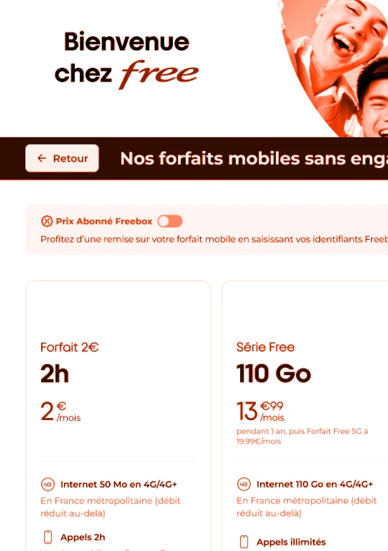
→ The web mirror: A toggle switch to change price views.
→ The direct view: Both price points displayed simultaneously (that was the option I recommended).
The result: After discussing with the advisors, 4 of them over 5 said they preferred the “direct view” version for two main reasons.
→ Reduced friction: Eliminated an extra interaction step (the toggle) which often goes unnoticed on large physical screens.
→ Sales enablement: Empowered advisors to use the price gap as a direct "hook" for Freebox upselling. The advisor who didn’t go with this version argued that there was a risk there would be too much information all at once, making it too difficult to choose.
The decision: In the end, after presenting the result to the marketing team and discussing with them about the pros and cons, we decided to go with the winner version. Today, our self-service kiosks still have this one.
Outcomes
User-driven decision: Provided the marketing team with qualitative evidence to pivot away from the web-standard UI in favor of a retail-optimized experience.
Identified opportunities: Not only the user (client) uses the kiosk as a way to subscribe but the advisors also use them for business argumentations.
Focused on kiosk experience: Raise awareness about the unique in-store kiosk experience, which may differ from what is more commonly found online.
Bonus
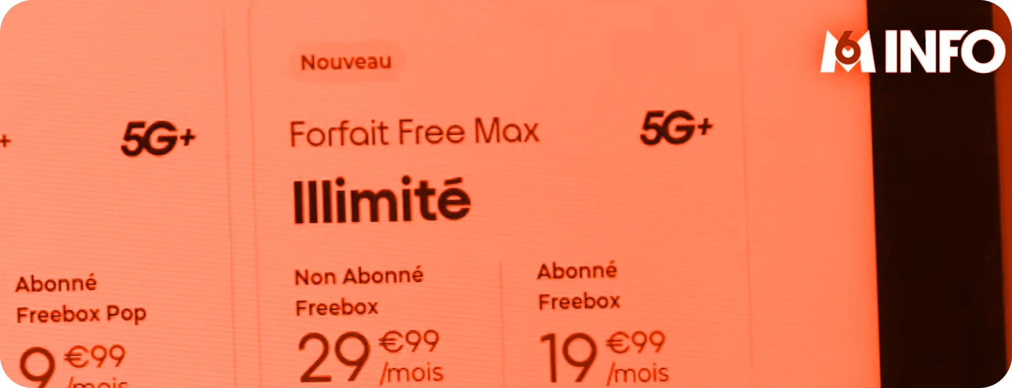
Our kiosks were on TV ➡️ take a look here ⬅️
How I work for kiosk screens 🕹️
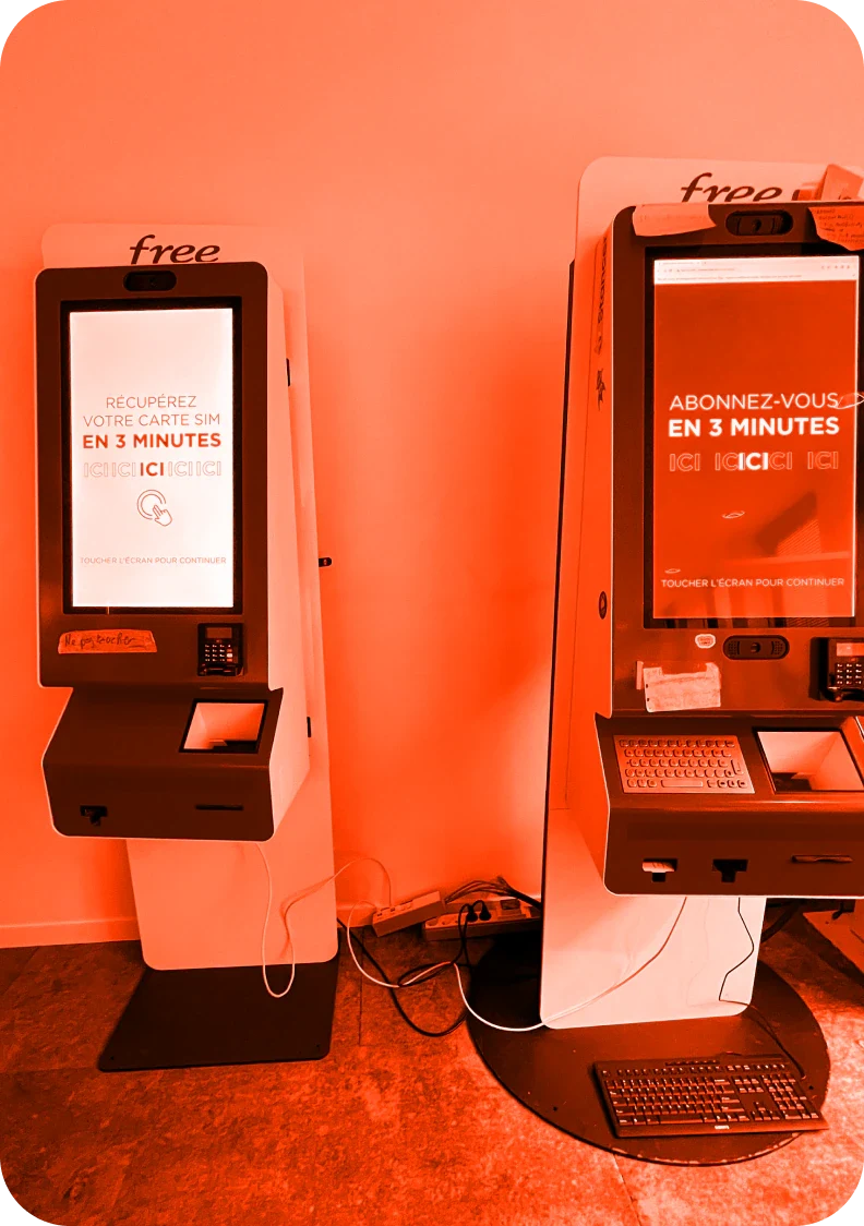
The kiosk on the left is the replica of our live production and the one on the right is our test environment.
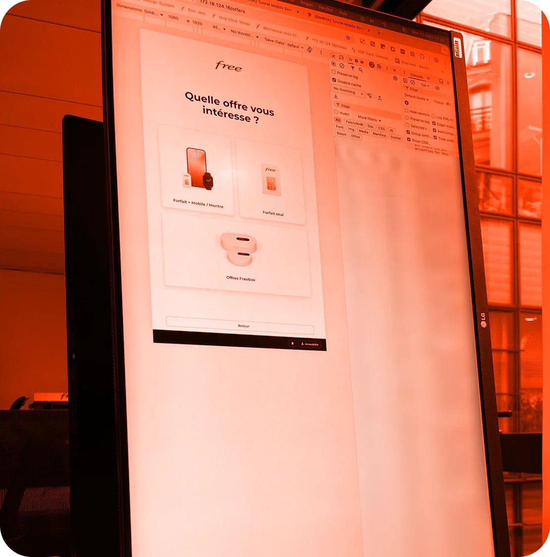
I can also access the pre-prod with a localhost link on the web. On top of that, I turn around my PC so it has the same orientation of the self-service kiosk, really helpful when designing on Figma and check the look and feel.