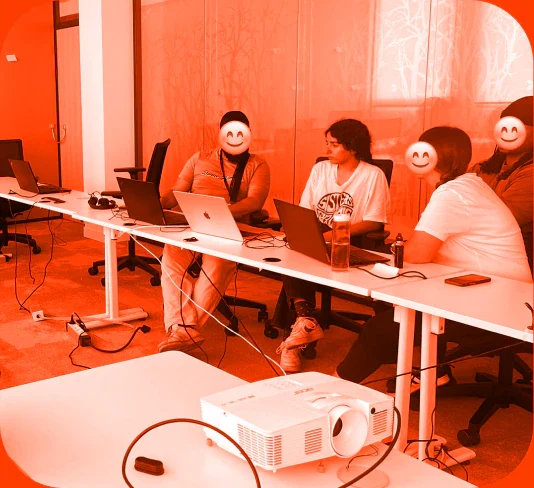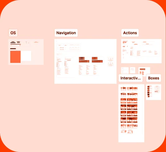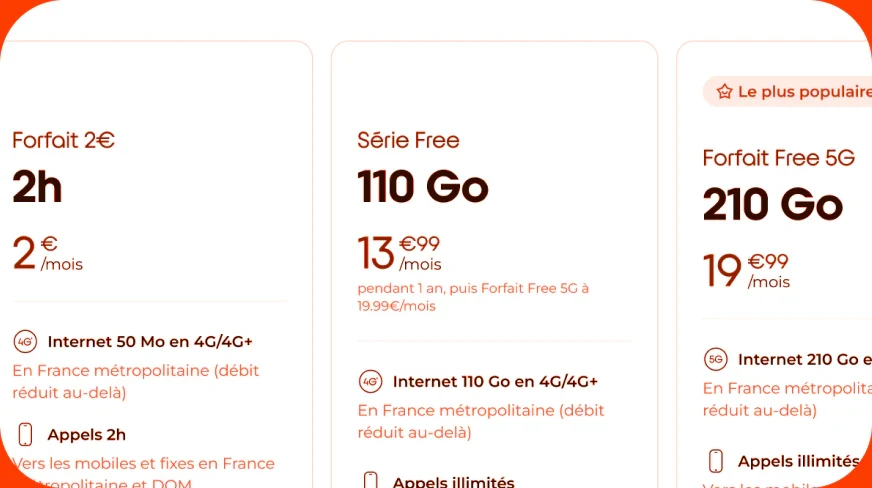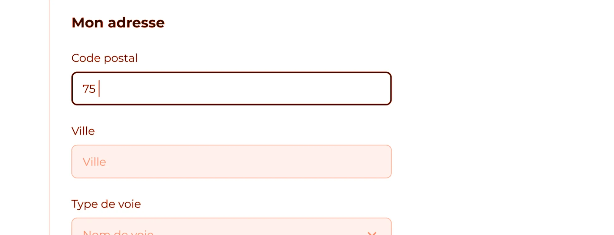
The address entry requires users to manually fill six separate input fields on a large vertical touch screen—a high-friction task.
Context
Our self-service kiosks had six separate input fields to ask the user their address info. This required us to add an extra step to the process, a “contact” step with name, last name, email etc. inputs and another step “my address” dedicated for these six fields. We knew it was obviously a friction but didn’t know how to prove it with numbers since we didn’t have any analytics tools for kiosks flows.
The goal: Leverage web-based insights to justify and implement a streamlined checkout experience on self-service kiosks.
The challenge: Free’s kiosks lacked behavioral analytics tools that were, however, available on our web platform. This created a "data blind spot" for in-store user behavior.
My approach
I acted as a bridge between platforms, using a "Data-Transfer" methodology to validate UX improvements where direct tracking was unavailable. For that, I worked hand in hand with the Product Designer in charge of the web platform and my PO.
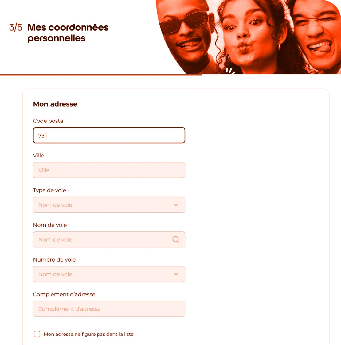
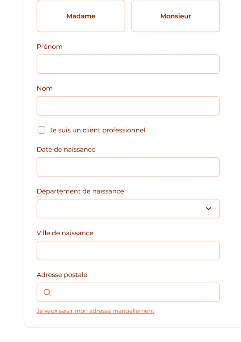
Web A/B testing: We ran an A/B test on the web platform comparing the 6-field legacy form against a single-field "Smart Address" auto-complete solution. The single-field version led to a +36% increase in users reaching the next step.
Technical implementation on kiosks: From what we learned thanks to web data, I worked with the kiosks engineering team to adapt this single-field logic, merging "Personal Info" and "Address" into one seamless step.
The result: I conducted on-site shadowing and interviews with shop advisors to observe the new flow in real-time. The estimated impact, based on field observations, was a 3-minute reduction in total subscription time per user.
Outcomes
Process efficiency: By removing the legacy 6-field system, we significantly reduced the "Time-to-Task" for in-store subscriptions.
Strategic cross-platform win: Demonstrated how to use cross-platform data to drive high-impact changes in environments without native analytics.
Bonus
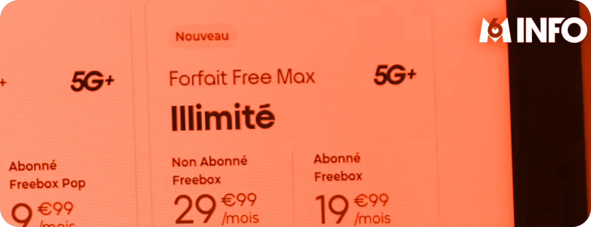
Our kiosks were on TV ➡️ take a look here ⬅️
How I work for kiosk screens 🕹️
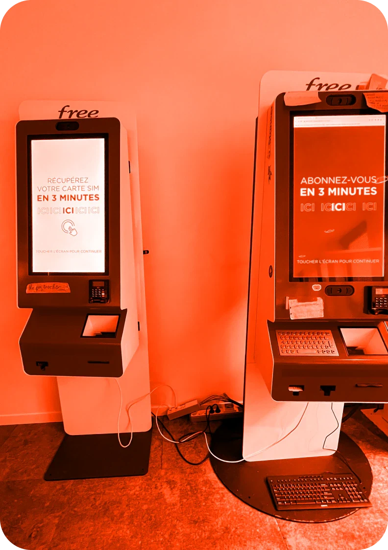
The kiosk on the left is the replica of our live production and the one on the right is our test environment.
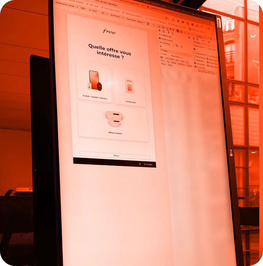
I can also access the pre-prod with a localhost link on the web. On top of that, I turn around my PC so it has the same orientation of the self-service kiosk, really helpful when designing on Figma and check the look and feel.